Website for
audwell
audwell (yes, with a lowercase ‘a’) is a premium brand that specializes in children’s furniture and goods. Their overarching mission is to instill harmony in households through their collection of minimalist, high-quality, and aesthetically pleasing pieces. Lauren, the founder and proprietor of audwell, is a mother of two who encountered difficulties in finding children’s products that aligned with her personal style and preferences. Taking matters into her own hands, Lauren established audwell to bridge the gap between functionality and design in the realm of children’s furniture. audwell firmly believes that integrating finely crafted children’s products into homes can enhance parent-child relationships by reducing stress and increasing presence. Seeking to enhance customer engagement and retention, audwell approached us to revamp their homepage and perform a site audit with the aim of reducing drop-off rates and re-engaging both new and returning customers.
Problem
Solution
Tools
Trello
Figma
Google Suite
Maze
Slack
Team
Erica S
UX Researcher
Tiffany P
UX Designer
Tiffany T
UX Designer
My Role
Project Manager
UX Researcher
Timeline
Overall: 3 weeks
Discovery & Research: 2 weeks
Design & testing: 1
Kickoff Meeting
After addressing all the necessary topics, we got right to work!
Step 1
Survey
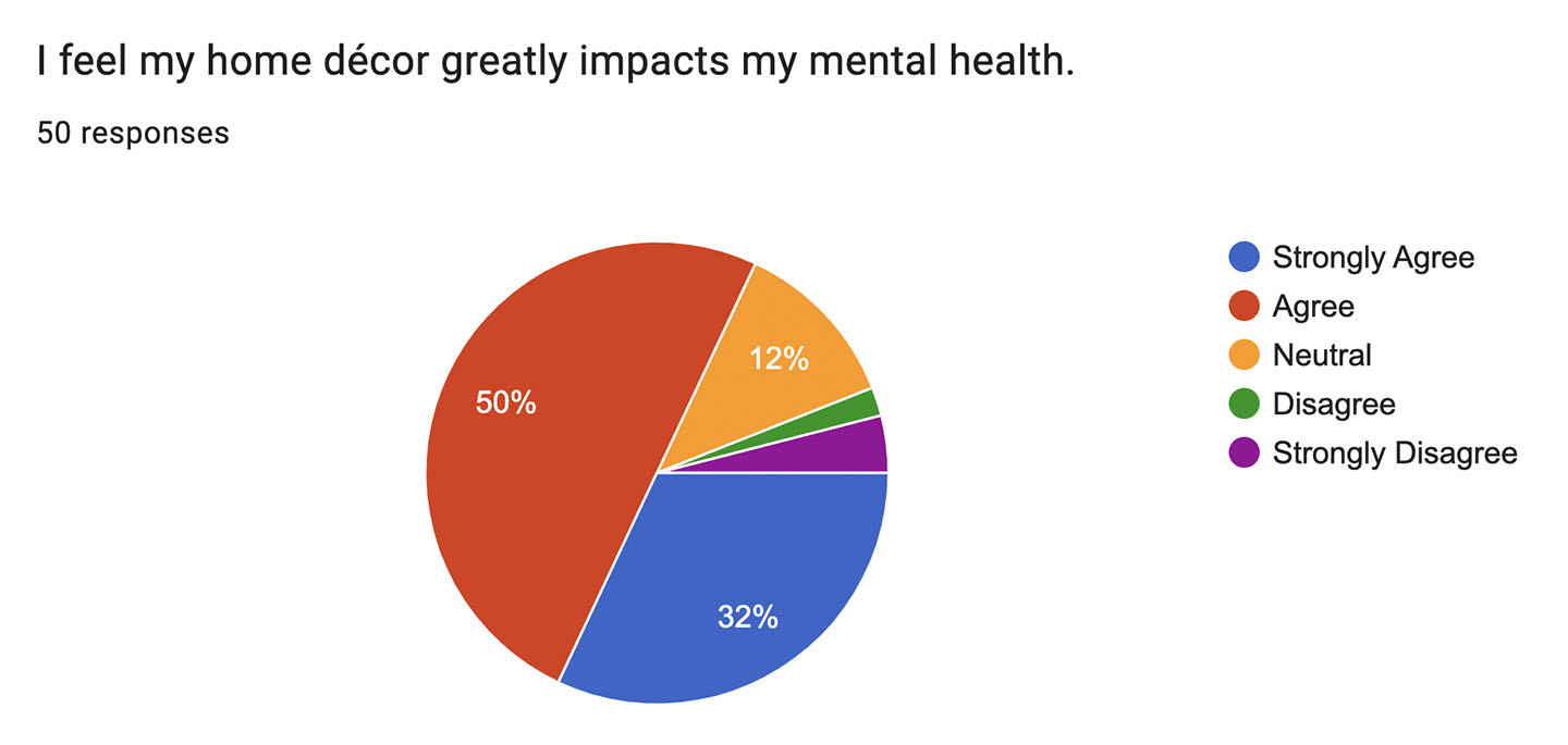
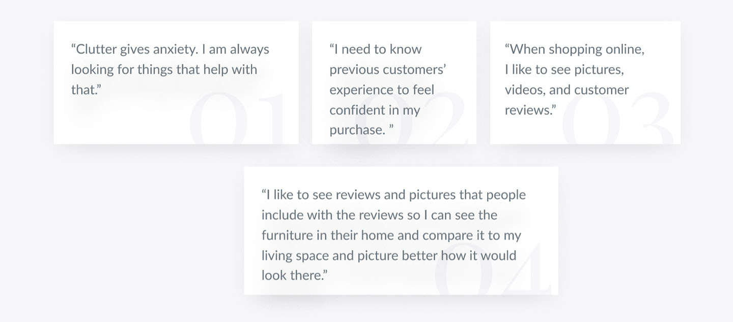
Following the project kickoff, we established our research goals and approach. Our primary focus was gaining insight into the target audience and their difficulties. To achieve this, I created an online-based survey and distributed it across multiple online communities. Within a short period of time, I received 50 responses. Based on the results, we identified four common pain points, which informed our subsequent actions.
(example shown)
Step 2
Interviews
Step 3
Affinity Map
Step 4
Persona
Step 5
Problem Statement & How Might We
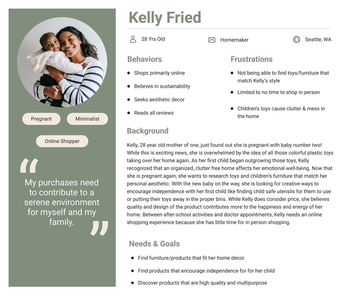
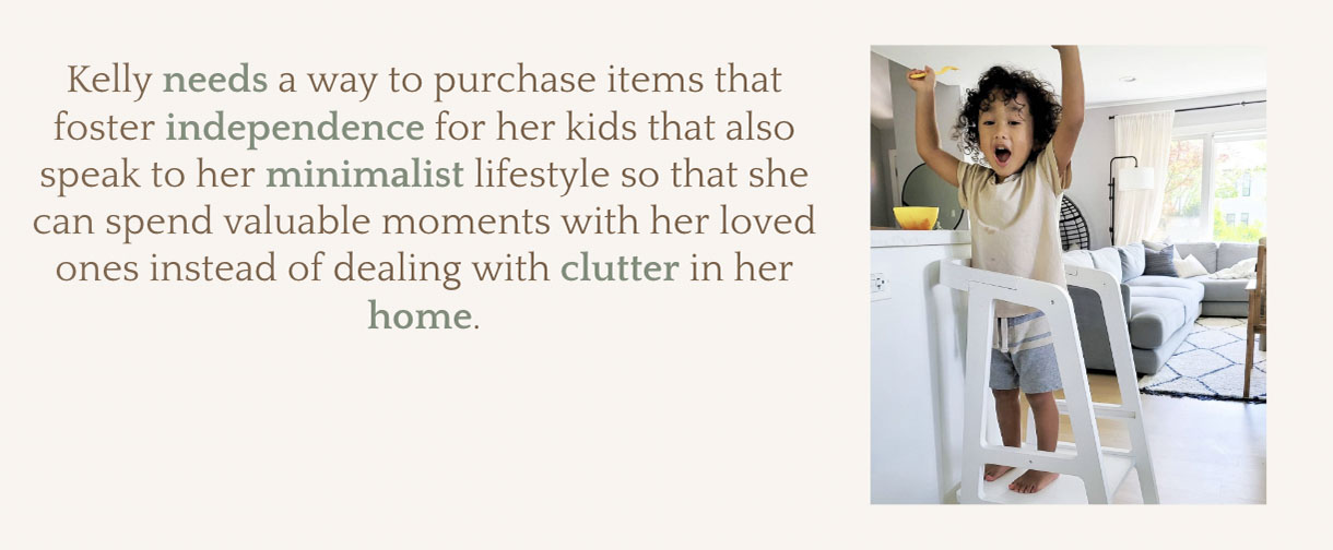
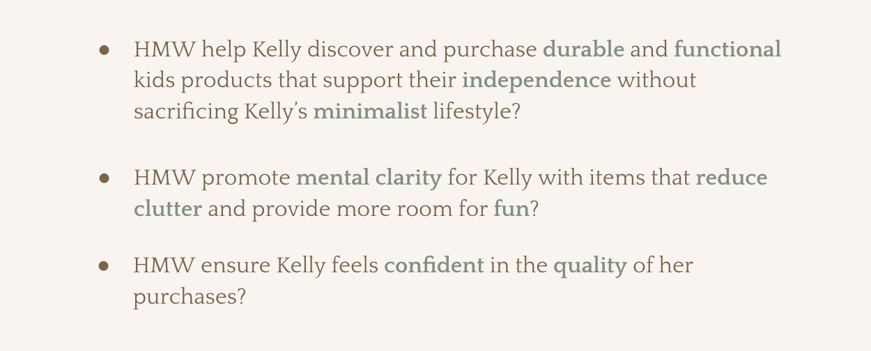
In addition to creating the user persona, I also developed the problem statement and “how might we” statements. It was a team effort to identify the key issues and opportunities, and I am grateful to have been able to contribute in these areas.
Step 6
Design System
Step 7
User Flows
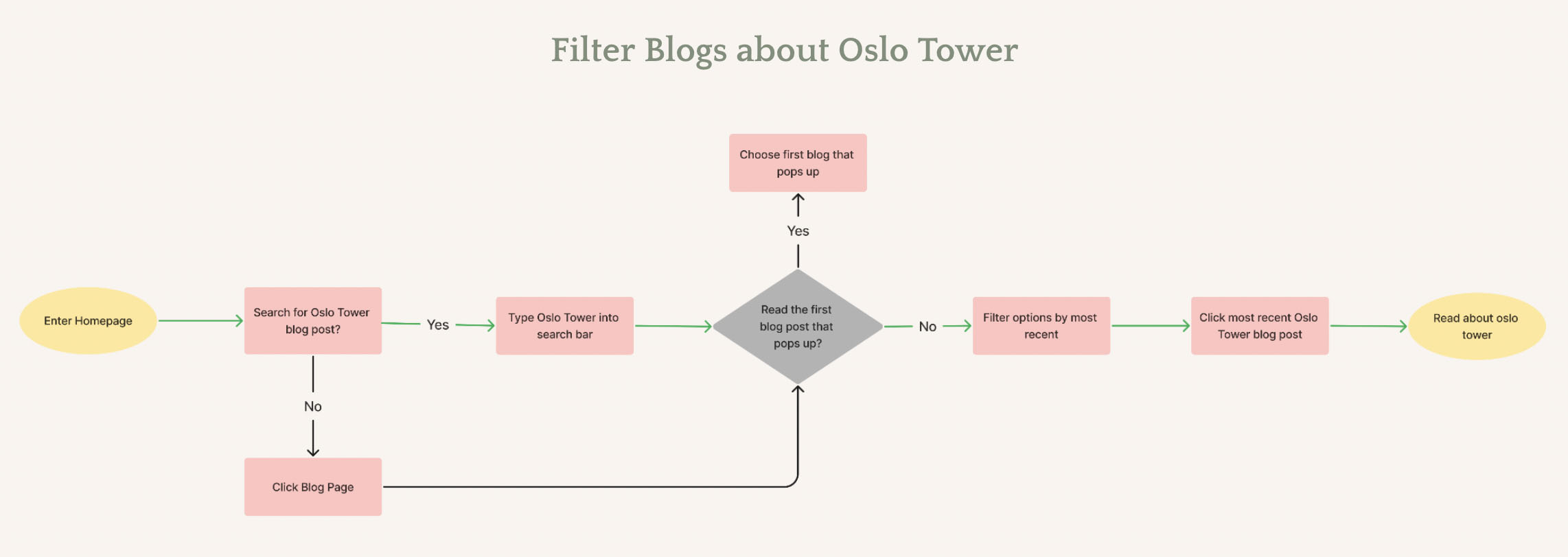
Our team created two user flows. The task for our first flow was to filter blogs specifically about the Oslo Tower. Blogs are a great marketing and SEO tool for e-commerce sites. By creating high-quality content you can attract visitors to your products and or services. By using keywords and phrases relevant to the product and or service, you can increase your site’s visibility in search results. So it was important for us to create user flows that test the user experience in audwell’s blog section. We wanted to make sure that the blog navigational tab and blog posts were easy to get to and filter through. In our second flow, the task was to sign up for rewards, watch an instructional video for the “Goldie Chair” and purchase a product. By including the task of signing up for rewards, users will be prompted with an incentive to continue browsing for items like the Goldie chair.
Step 8
Mid-fi Designs and Usability Testing Results
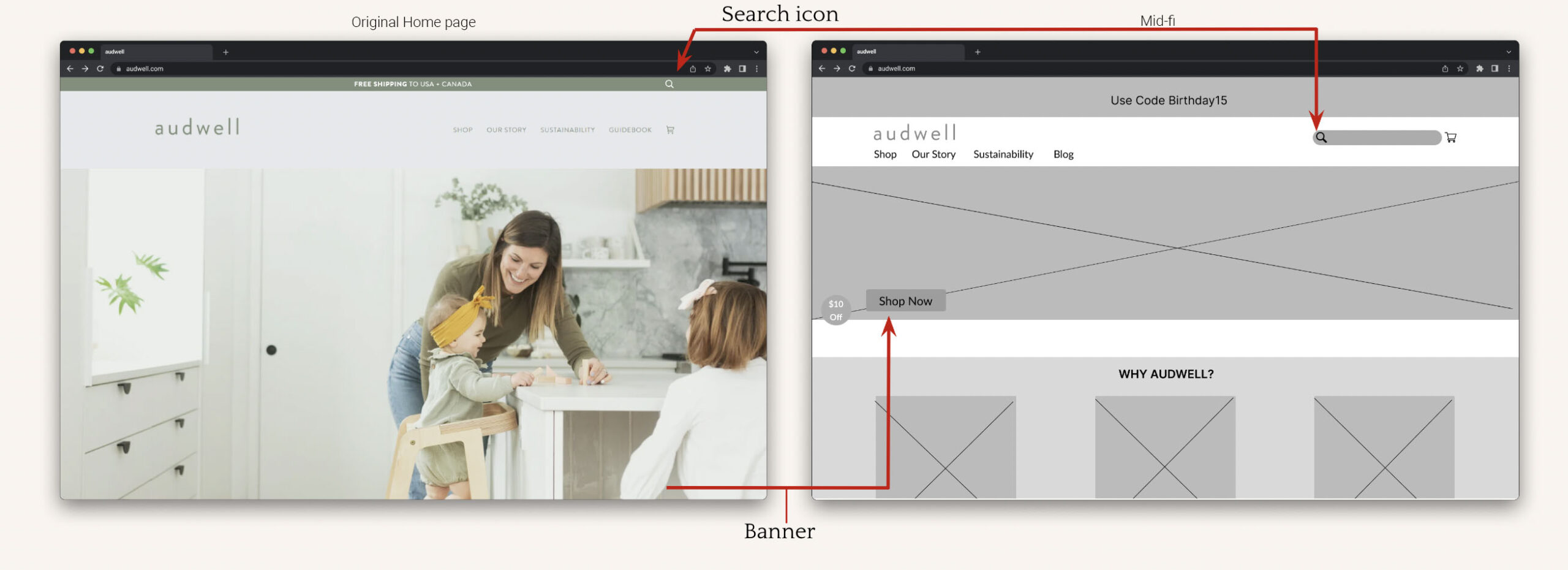
During preliminary usability testing, 43% of testers had difficulty locating the search bar on the homepage. To address that issue, we made the search icon more visible and accessible, allowing users to search for products much easier.
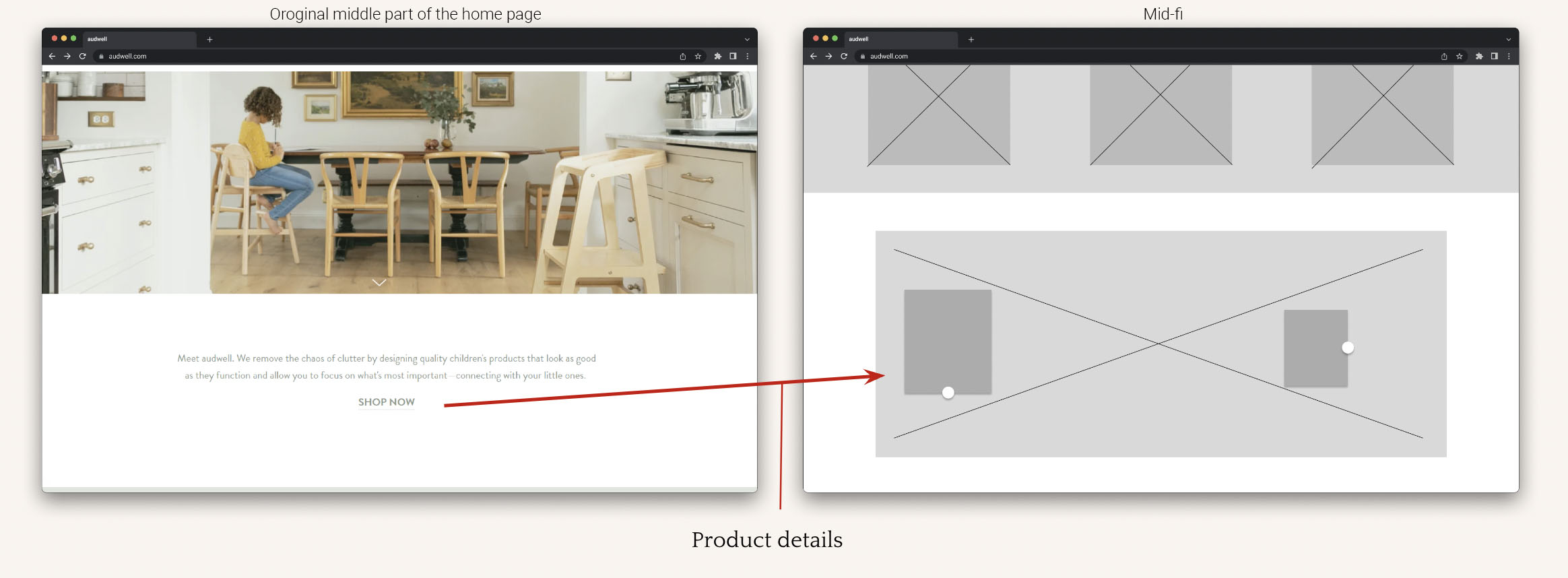
One of our objectives was to address the client’s concern regarding high homepage drop off rates by exploring ways to reduce them. According to Baymard Institute, which identifies causes for usability issues, 59% of websites using carousels have user errors, one error being confusion about the products being purchased. To fix this issue, the team shrunk the banner and the images no longer rotate. We replaced it with a “Shop Now” button for users to easily access the product page.
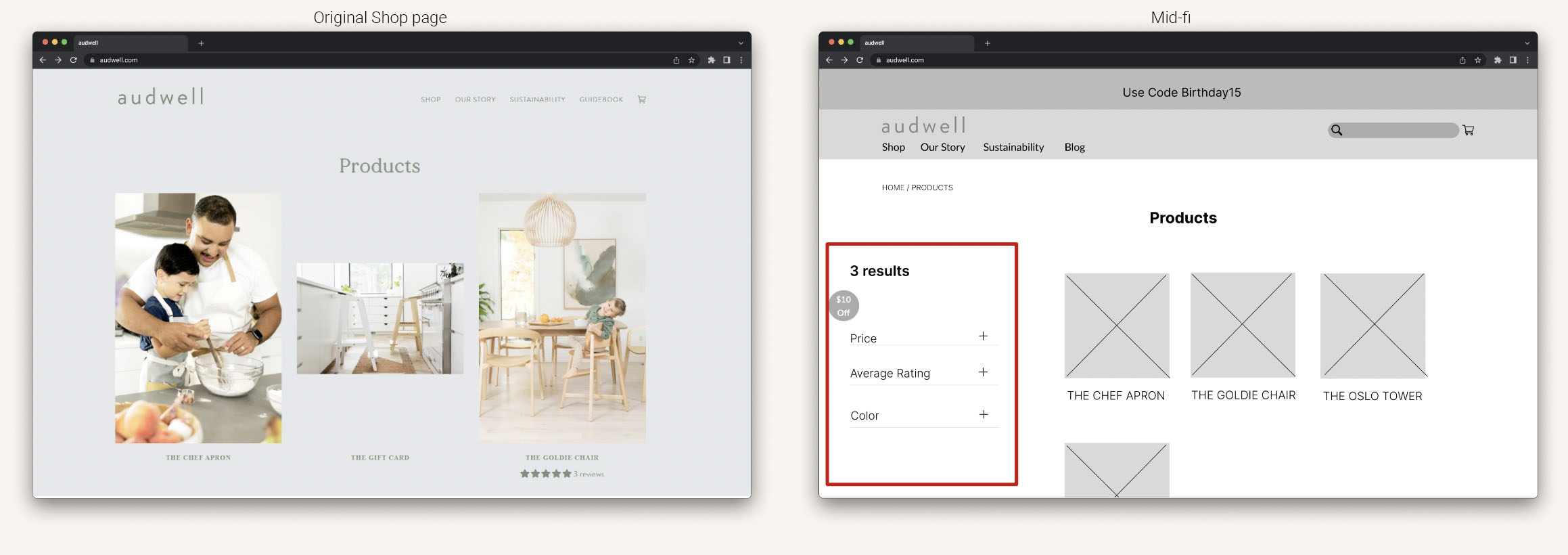
While the product page remained unchanged, we did add a filter option. As the client expands their inventory, users would become more interested in a filtering option to make the search process easier.
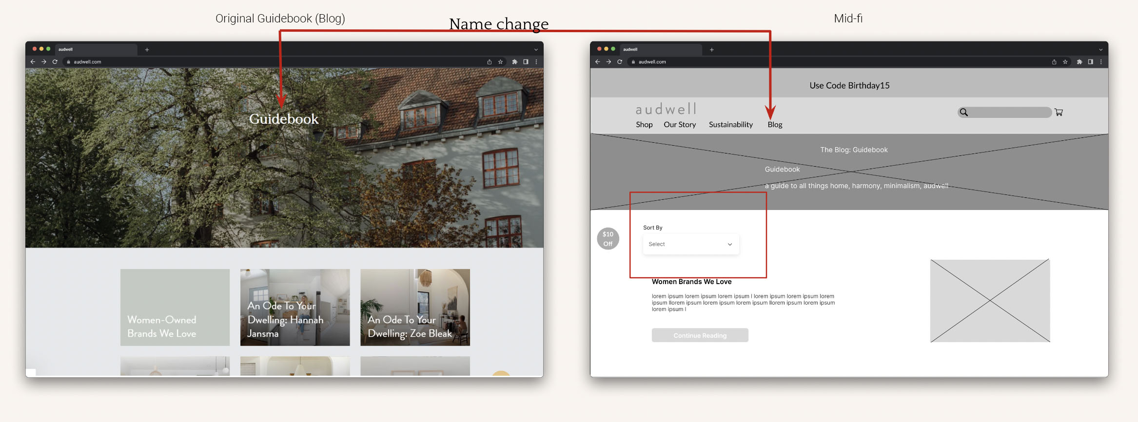
Finally, we added an update to the blog section. Our preliminary research showed that 50% of users were having trouble locating the blog section because it was labeled as “Guidebook”. To reduce confusion, the team changed Guidebook to Blogs and added a sorting option to optimize searching for a specific article.
Step 9
Hi-fi Prototype
And this is our hi-fi prototype. When you land on the website, you will see a pop-up that offers a $10 discount on your first order when you sign up for audwell’s mailing list and the discount will be automatically applied to your order. On the homepage, you will see the pulsing buttons, or hot spots, on the dining room set that provide information about the different products with the option to shop directly from the item’s description. Additionally, the site now offers multiple ways to shop. The team also added an Instagram gallery featuring images of customers using audwell’s products. We did this based on interview and survey responses, requesting to see the product in use by real customers. As mentioned previously, the blog is now easier to navigate because of the filtering options. We also made it easier to see product details without having to scroll too far down on the page. Lastly, a confirmation page is displayed once the customer completes the purchase. From the confirmation page, the customer has the option to continue shopping or return to the homepage.
Next Steps
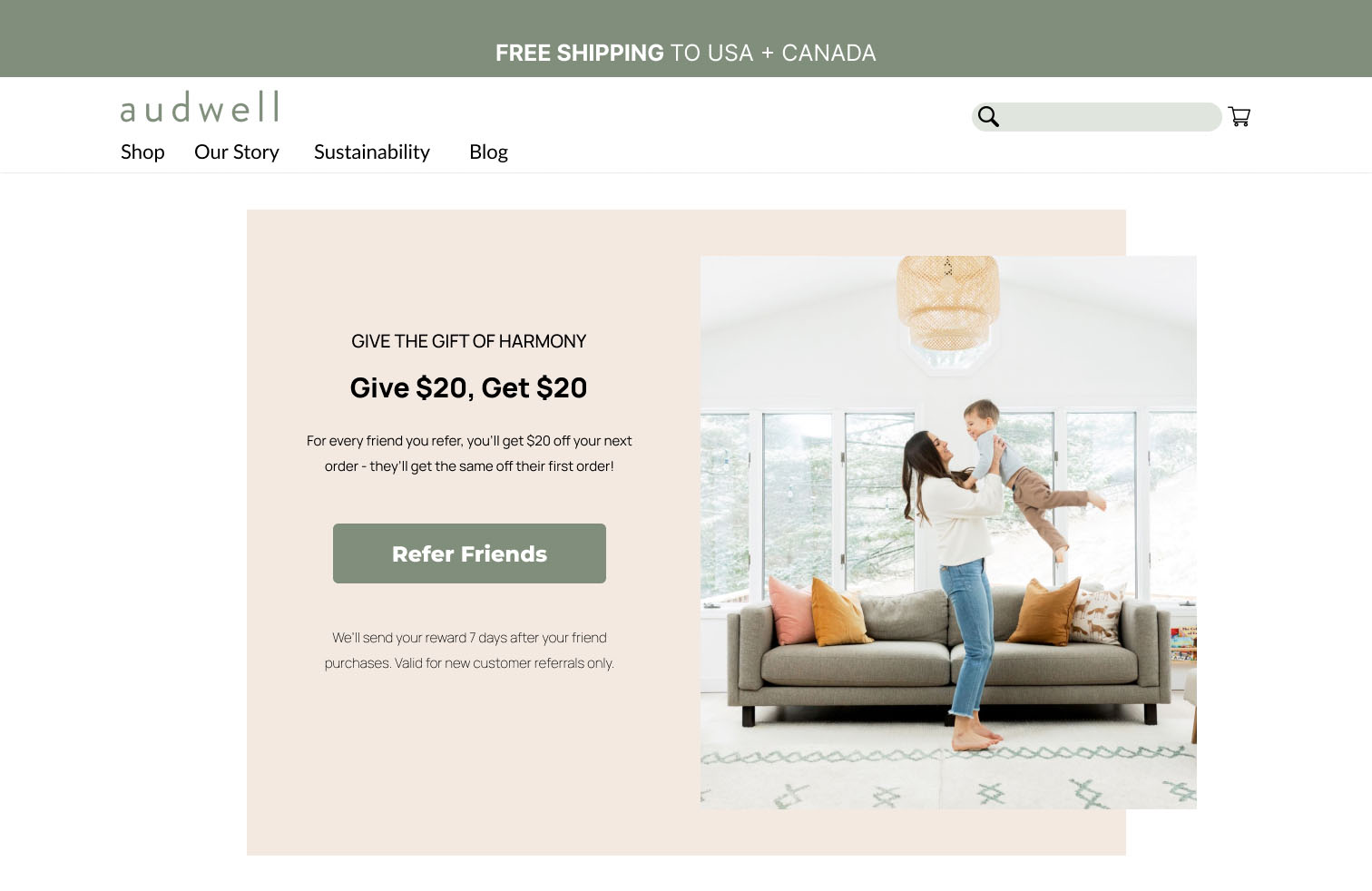
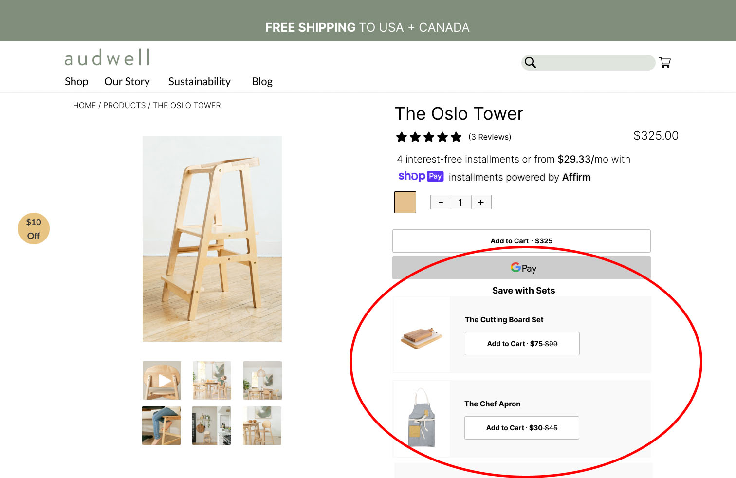
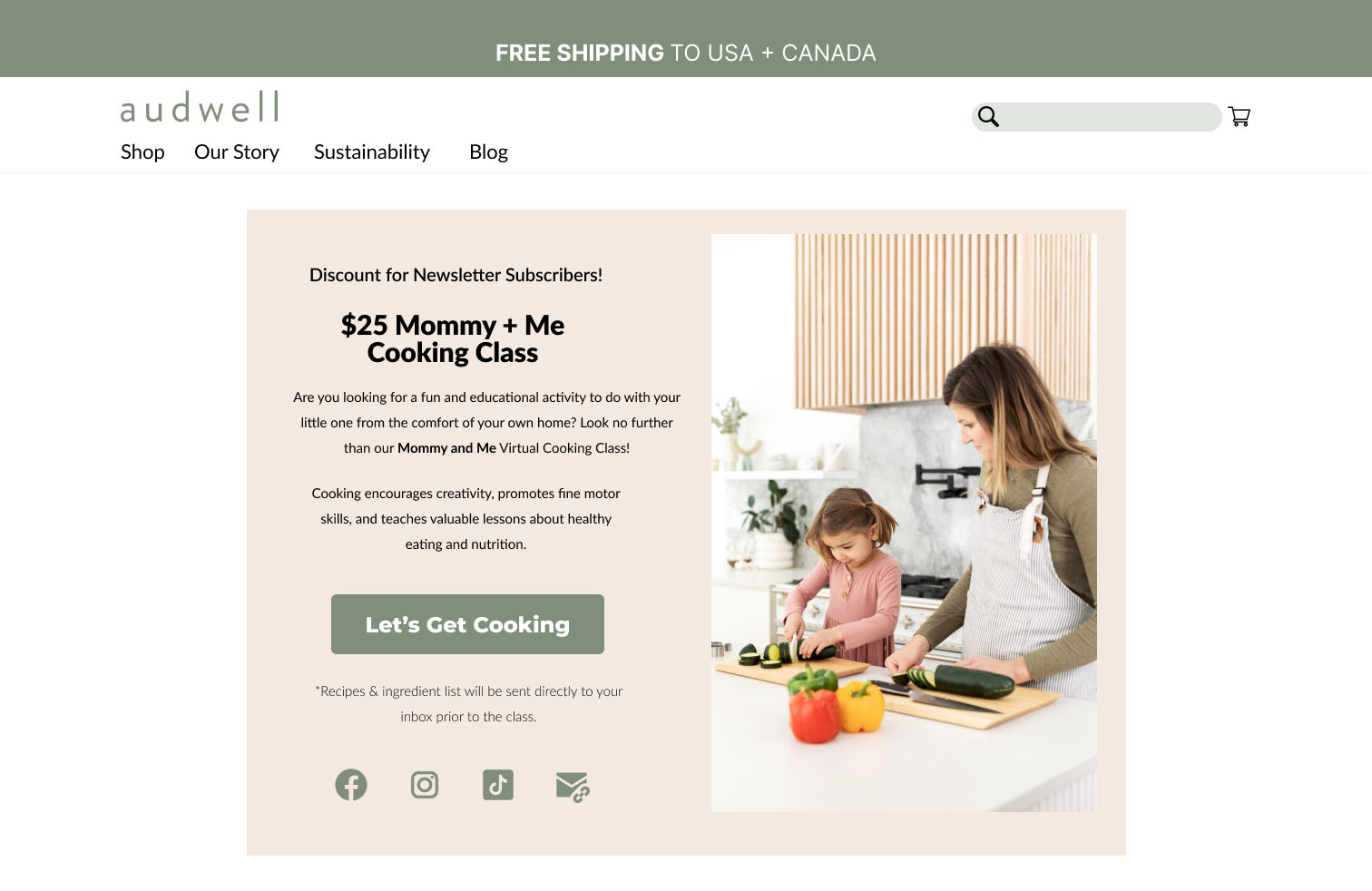
For the next steps, I collaborated with Erica (UX Researcher) to come up with ideas that could help our client generate more business. We focused on ideas that would have a positive impact on audwell’s overall growth and success. We proposed a referral program, bundle packages, and virtual mommy & me classes.
1.
A referral program is a great way to incentivize existing customers to bring in new customers to the business. By offering a reward for a successful referral, the client can encourage an existing customer to advertise the company, resulting in a higher number of qualified leads and conversions.
2.
A bundle package is a great way to increase the average order value of customers. By combining similar products and offering them at a slightly discounted rate, encourages customers to purchase more than one product. This can lead to increased revenue.
3.
Virtual Mommy & Me classes is a fun way to connect customers and build a sense of community around the client’s brand. Offering classes that align with the client’s demographic can create brand loyalty, repeat customers, and positive feedback and reviews.
Learnings
As the Project Manager and Researcher for this project, I learned the importance of collaboration, client communication, project management and research. Working in UX requires collaboration, and I was able to work effectively with my team to achieve our project goals. As the point of contact with the client, I practiced my communication skills and built a strong relationship with them. Using tools like Trello, I was able to manage the team’s work and keep everyone accountable. I did daily check-ins with the team to make sure everyone was on track. Additionally, I did a lot of research for this project, using several different methods to analyze data and make informed decisions. I am happy to say that we got great feedback, with the client implementing several changes to their site based on our recommendations!

